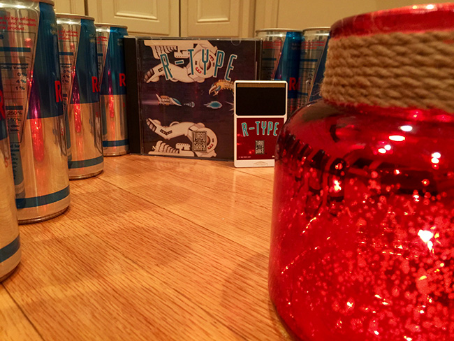
Wow I've never seen the TG16 R-Type box art before. What the hell were they thinking redrawing the art for TG16 games, it's like they went out of their way to make it look lame Also why change the font on the name to make it look boring and generic? Baffling!
It is amazing—so much work and effort for bland results.
However, I have long-argued that the North American art should be appreciated.
Life is boring if the original PCE art was recycled.
And, sometimes, the NA art is better. Rarely...but it happens.
LEGENDARY AXE is superior, for example.