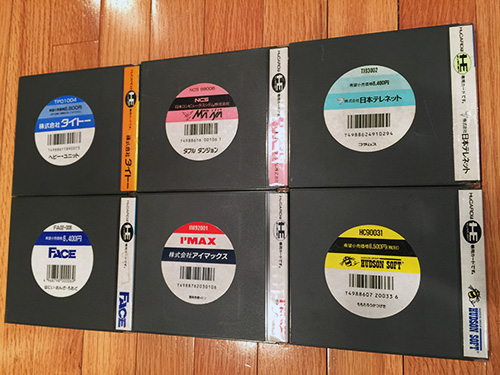
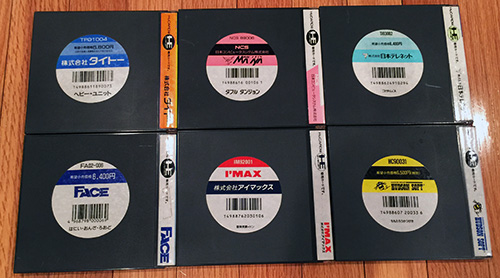
UPDATE: I was just looking at a photo on my phone and decided to post it, too, since I think you folks don't read and just look at pictures. YOU KNOW IT IS TRUE.
SPINE STICKER: I didn't talk about the spine sticker in the prior post, but it's worth mentioning, too.
I personally find the spine sticker aesthetic to be pretty standard (not nearly as captivating as the UPC), but it is fun to see the variations in color/font/logo across a few different companies.

TAITO (Heavy Unit) Masaya/NCS (Double Dungeons) Telenet (Columns)
FACE (Hany on Road) I'MAX (Lost Sunheart) Hudson (Peach Cobbler)
Here is the full-size pic:
http://junk.tg-16.com/images/UPC_on_PCE2.jpg{Rant}
DAMN! I can't believe that nobody appreciates the early PCE aesthetics!
The UPC stickers have a great design... they provide uniformity across all releases but with some flexibility to add subtle variations. I submit that the UPC design is quite contemporary. It would not seem out-of-place on a chic product sold in 2015. Suck my left one.
{/Rant}
