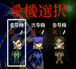
I'd really like to have Lvl and Exp in there just because it seems to fly over so many people's heads that there is a level-up system in the game in the first place. I mean, if it looks god-awful, then that's one thing, but if it looks only a little weird, I say go with it. It's worth it to get these factors hammered in.
I think the LV and XP are all right, but tell me if you agree with me on this: I think almost everyone who sees Lvl and Exp is going to think "level" and "experience" no matter what, but LV and XP are going to have a somewhat lower success ratio. Remember, this is a shooter, and people aren't expecting a level-up system. I'd like to see if Lvl and Exp are workable first.
Yes, boss!

You're right, understanding that is vital to getting how to play the game ...
So ... seriously ... if you really want that hammered in , and if we can't come up with something "artistically-beautiful" ... then I can just use the 8x16 menu font to write in "Lvl" and "Exp".
It will mean moving the numbers over by a few characters, but it's possible. It'll probably
only be another 175 patches to put in (2 icons and 2 numbers at screen setup, 1 number during screen update - all times 35 levels).
Heck ... if I'm going that far, we can make them 32x16 graphics and do them as thick italics to match the numbers ... or just switch the numbers to the menu font.

AFAIK the title on the title screen and the background are one image. This text, however, is all in a separate layer from the background.
I think that I may have originally told you that, but I was wrong. The guys that did this particular screen did it as 2 layers, foreground and background, but each layer is a complete tileset/tilemap. So the big red letters are not pre-composited into the background ... but neither are they easily editable in-place. It would mean converting the foreground layer into a bitmap, changing it, and then reconverting it to a tilemap (using the same number of tiles).
After thinking about this screen a bit more ... I can just draw the font text into the existing tileset and modify the screen before it is displayed to get the "Type-1" and "Lvl" ... and basically treat it somewhat like the other screens, but modify it in RAM instead of in VRAM.
BTW ... this is one of the 2 front end screens that I can think of that puts "foreground" text into a King background (new PC-FX chip) instead of a VDC background (old PCE chip).

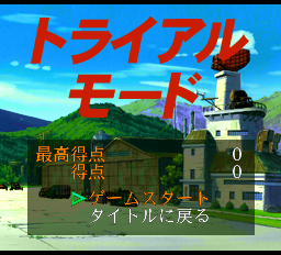
Finally, there's this, from the Trial Mode. Don't worry about the stuff in the lower half, because that's elmer's final hacking task.
Hahaha ... well, it's the last one for functional English menus, anyway!

The big red letters simply say "Trial Mode", but it seems that like the title screen, they are baked into the image.
Yep, this time they're baked into a King background. The menu is in a VDC background as normal.

This is essentially the Game Over/Continue screen. If you see it in the game, you'll notice that the Yes and No fade back and forth with the Japanese in the background. I don't think that needs to be changed, and I also think that this means you can superimpose new English text over the other stuff just using the opposite color - white over red and red over white.
Just like the "Ship Select" screen, this one uses a foreground layer and a background layer that are both in King background memory.
Even though it's a pre-converted tileset/tilemap, there's enough space in there that I can replace the "Continue?" with any reasonable English phrase using a method similar to the "Ship/Pilot Select" screen.
There's one more screen that we've missed talking about ... the "Trial Mode" result screen (screenshot below) ... that's all in a VDC background ... and the big Japanese text is done as 2 128x64 bitmaps which would be relatively easy to change.
But, purely in my own opinion, and this applies to all of the screens ... once the menu itself is in understandable English, I really don't care if the menu's title is in English or Japanese.
It's always easy to work out what is going on ... and the Japanese kanji are often beautiful to look at.
Those kanji often express complex ideas that it takes a lot of roman characters to express in the English language ... I think that we'll have a hard time coming up with replacement graphics on a lot of these screens that looks as nice in the same memory footprint.
It's the memory that going to be the biggest problem ... I don't have anywhere near enough space in the area that I'm using for the current patches to store new graphics.
Anything would have to fit into the same space as the current graphics.
[EDIT]
Wow ... lots of typos to fix in that one!