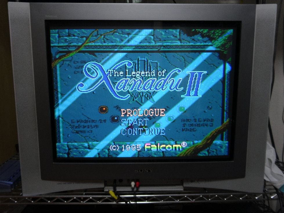
Author Topic: Xanadu II Translation Development Blog  (Read 39255 times)

elmer

  • Hero Member
  • *****
  • Posts: 2153
Re: Xanadu II Translation Development Blog
« Reply #375 on: June 08, 2016, 05:34:27 AM »
I looked into that sparkle effect... I'm totally stealing it! ;>_>

It's a really clever and effective work-around for not being able to fade in the logo from a serarate layer.

Well worth stealing!  :wink:


The lower left end of the X is the first and maybe only thing that stands out to me as potentially benefiting from some tweaking. It seems a bit stubby and high. I don't know if that's what you were talking about, but anyway... :-"

This is quick and dirty, but I lengthened the leg a few pixels and squeezed in the curly part slightly. Does it look at all better to you guys just in terms of proportion?

I don't really mind it either way.

We're latching onto different things.

For me, it is the slight inconsistencies in the shapes and visual height of the letters that is much more noticeable.

That's a side-effect of Phase turning the logo into vector format, and then re-rasterizing it at the new size.

It is to be expected ... it just needs (IMHO) a massively nitpicky cleanup pass to get closer to that "hand drawn" look of Falcom's original.

I'd be tempted to make the "The Legend Of" a pixel or 2 taller and see how it looks, too.


I'll continue with some of what I'd planned to try with that logo and another wingless one I'm balancing out.

IMHO, if you want to keep working on Falcom's logo, one thing that you'll need to do is to make the lines thicker so that it doesn't look so lost on the screen.

Here's a simple doubling of the width. Note that I separated all the letters, then did the doubling, then pasted them back together so that I could control and tweak the spacing.


« Last Edit: June 09, 2016, 04:38:32 AM by elmer »

Phase

  • Sr. Member
  • ****
  • Posts: 356
Re: Xanadu II Translation Development Blog
« Reply #376 on: June 08, 2016, 11:16:43 AM »
Here's my latest from yesterday.


Maybe I'll try a version where the letters are similar and more font like.
Will take a closer look at SamIAms mod and other input.


jtucci31

  • Hero Member
  • *****
  • Posts: 1648
Re: Xanadu II Translation Development Blog
« Reply #377 on: June 08, 2016, 04:12:43 PM »
Man I love the development of these logos, they look FANTASTIC.

The logo Phase made looks really nice, especially with all of those colors in it. But I also think that end screen text would look good too if done properly.


Phase

  • Sr. Member
  • ****
  • Posts: 356
Re: Xanadu II Translation Development Blog
« Reply #378 on: June 08, 2016, 05:30:31 PM »
Ok here is a version where the letters are cloned with a few slight tweaks

Then here it is with a pixel taller "The Legend of"

Necromancer

  • Global Moderator
  • Hero Member
  • *****
  • Posts: 21365
Re: Xanadu II Translation Development Blog
« Reply #379 on: June 09, 2016, 02:51:12 AM »
I don't have much of an opinion on the various logo options (other than the obviously bad ones that y'all immediately rejected), I'm just happy that it's all coming together and looking so professional.

All this logo chat makes me want a translated title for Motteke Tamago.
U.S. Collection: 97% complete    155/159 titles

elmer

  • Hero Member
  • *****
  • Posts: 2153
Re: Xanadu II Translation Development Blog
« Reply #380 on: June 09, 2016, 08:20:58 AM »
I don't have much of an opinion on the various logo options (other than the obviously bad ones that y'all immediately rejected), I'm just happy that it's all coming together and looking so professional.

All this logo chat makes me want a translated title for Motteke Tamago.

Yep, a good logo is a thing of beauty, and really helps to set the expectations for the attention-to-detail in the game.

The Motteke Tamago logo looks good in Japanese, but it would certainly be nice to see an English one in there to "finish off" the translation!  :wink:


Ok here is a version where the letters are cloned with a few slight tweaks

Hahaha ... that's more than a few "slight tweaks", that's an absolutely beautiful job of cleanup work!

You've fixed all the little areas that were catching my eye, and a changed a few extra little details that just add even more polish.

I really can't exaggerate just how happy I am at the way that this looks.  :dance:

For those that can't immediately see just how much changed, and what an absolutely lovely effect it has on the look of the logo, here is a before-and-after animation.

There are also the 2 sizes for the "The Legend Of" text. I prefer the larger of the 2, because IMHO it makes the letters less squat, and it makes it look more deliberate and less like a subtitle.


« Last Edit: June 09, 2016, 08:24:22 AM by elmer »

spenoza

  • Hero Member
  • *****
  • Posts: 2751
Re: Xanadu II Translation Development Blog
« Reply #381 on: June 09, 2016, 02:40:58 PM »
What would happen to that logo if the ligatures were connected to make it look even more script-like? Most seem to run into each other OK, but the 'a' and the 'n' and the 'd' and the 'u' don't connect, but they look like they could very easily.
<a href="http://www.pcedaisakusen.net/2/34/103/show-collection.htm" class="bbc_link" target="_blank">My meager PC Engine Collection so far.</a><br><a href="https://www.pcenginefx.com/forums/" class="bbc_link" target="_blank">PC Engine Software Bible</a><br><a href="http://www.racketboy.com/forum/" c

Necromancer

  • Global Moderator
  • Hero Member
  • *****
  • Posts: 21365
Re: Xanadu II Translation Development Blog
« Reply #382 on: June 10, 2016, 02:34:49 AM »
What would happen to that logo if the ligatures were connected to make it look even more script-like?

It'd no longer match Falcom's original design.
U.S. Collection: 97% complete    155/159 titles

SamIAm

  • Hero Member
  • *****
  • Posts: 1835
Re: Xanadu II Translation Development Blog
« Reply #383 on: June 10, 2016, 04:18:12 AM »
Looking damn good, Phase. :D


Here, you can see what it looks like against the black background up close and at a slight angle. Notice that some green pixels are standing out now, like between in the tails of the a and the d, and between the X and the a.
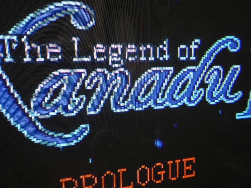


I see by looking at the raw png that it wouldn't be easy to erase those without making an inconsistency in the outline pattern, but it also looks like you could probably "cheat" a little and get away with blanking a select few of them. Fiddling around on my own, I was able to separate the X and the a and the tails in a way that I think would work fine with just a few clicks.

After that, we have to wonder what to do with the interiors of the a and d, the upper interior of the n, and the lower interior of the u. Against the black, they do look kind of green. However, it's possibly negligible.

This is all RGB, by the way.

EDIT: Here's a head-on shot from a little further away. I cropped the image because my dumb reflection showed up a lot more in this one.


-----------------------

Elmer fixed the sparkle effect. Here is short, effectively sound-free demo of it working. I couldn't be bothered to turn on my speakers, or to edit the video at all before I uploaded it.  :mrgreen:

« Last Edit: June 10, 2016, 05:01:48 AM by SamIAm »

elmer

  • Hero Member
  • *****
  • Posts: 2153
Re: Xanadu II Translation Development Blog
« Reply #384 on: June 10, 2016, 04:44:12 AM »
What would happen to that logo if the ligatures were connected to make it look even more script-like? Most seem to run into each other OK, but the 'a' and the 'n' and the 'd' and the 'u' don't connect, but they look like they could very easily.

Here's a quick programmer-hack to give a rough idea of what it would look like ...


The answer, IMHO, is "clever, but way too busy on the screen, and making the letters harder to read".


It'd no longer match Falcom's original design.

And there's also that very important aspect, too.  :wink:


Here, you can see what it looks like against the black background up close and at a slight angle. Notice that some green pixels that are standing out now, like between in the tails of the a and the d, and between the X and the a.

Hahaha ... your turn to be nitpicky! :lol:

I'll try to figure out where I can hack in something to change the palette color of those outline pixels when the screen changes to black.

I like the way that they're smoothing out the edges when it's on the green background, so I don't want to remove them ... which is totally unlike me and my regular fetish for putting drop-shadows on everything!

<EDIT>

OK, here's my suggestion for changing the 2 outline colors when on the black background.

I don't know how to achieve it, yet ... but I think that it will look better when I can find out where to do it.


« Last Edit: June 10, 2016, 05:12:35 AM by elmer »

SamIAm

  • Hero Member
  • *****
  • Posts: 1835
Re: Xanadu II Translation Development Blog
« Reply #385 on: June 10, 2016, 03:17:38 PM »
That would definitely take care of the problem in the cleanest and most well-rounded way.  :D

If a palette shift can't work for whatever reason, the only real problem is the one darker-green edge shade (72, 180, 180). I think it only stands out when there are two of those color pixels next to each other horizontally, and even then, only in certainly places.

Also, like I said, the only spots that really stand out are the X-and-a connection and the a-and-d tails. It might be best to erase those connecting pixels regardless of what the palette is.

Original:


X-and-a and tail connections erased:
« Last Edit: June 10, 2016, 04:29:11 PM by SamIAm »

spenoza

  • Hero Member
  • *****
  • Posts: 2751
Re: Xanadu II Translation Development Blog
« Reply #386 on: June 11, 2016, 06:09:24 AM »
What would happen to that logo if the ligatures were connected to make it look even more script-like? Most seem to run into each other OK, but the 'a' and the 'n' and the 'd' and the 'u' don't connect, but they look like they could very easily.
The answer, IMHO, is "clever, but way too busy on the screen, and making the letters harder to read".

It'd no longer match Falcom's original design.

And there's also that very important aspect, too.  :wink:

I think the former is a far more compelling reason than the latter. We are already dabbling in the area off artistic license. If it looked better, I'd say a little inconsistency with Falcom's original vision was not an issue (especially for something minor like that). But Elmer is right. It does make it awfully busy and detracts from an otherwise clean logo.
<a href="http://www.pcedaisakusen.net/2/34/103/show-collection.htm" class="bbc_link" target="_blank">My meager PC Engine Collection so far.</a><br><a href="https://www.pcenginefx.com/forums/" class="bbc_link" target="_blank">PC Engine Software Bible</a><br><a href="http://www.racketboy.com/forum/" c

elmer

  • Hero Member
  • *****
  • Posts: 2153
Re: Xanadu II Translation Development Blog
« Reply #387 on: June 11, 2016, 09:32:26 AM »
I'll try to figure out where I can hack in something to change the palette color of those outline pixels when the screen changes to black.

That would definitely take care of the problem in the cleanest and most well-rounded way.  :D

If a palette shift can't work for whatever reason, the only real problem is the one darker-green edge shade (72, 180, 180). I think it only stands out when there are two of those color pixels next to each other horizontally, and even then, only in certainly places.

Well, it is possible to use a different palette for the logo when it is on the black background, that's the good news.

The problem is that there's no way to just fade between the different outline colors when the background fades out.

Now, I can just switch the outline color when the background has finished fading out ... but it looks jarring and horrible.

The only way that I can reasonably do it, is to fade out the logo together with the green background, and then fade it back in with the new outline color when the background with the stars fades in.

That's OK, and doesn't look too bad ... but it is different.

While we're still looking at whether that is worthwhile ... I just went ahead with SamIAm's idea, and just modified the image to avoid the cases where those outline pixels bump together.

That involved moving the entire "X" one pixel to the left, which I think might actually look better anyway.  :-k

Here's the result ...


SamIAm

  • Hero Member
  • *****
  • Posts: 1835
Re: Xanadu II Translation Development Blog
« Reply #388 on: June 11, 2016, 01:51:06 PM »
That could definitely work. :D

I'll glady do another TV test anytime.  :wink:

SamIAm

  • Hero Member
  • *****
  • Posts: 1835
Re: Xanadu II Translation Development Blog
« Reply #389 on: June 12, 2016, 04:25:45 AM »
This leaves nothing to be desired, really. Great work, Phase.  8)


(CRT capture-weirdness on this last one. Sorry.)

I want to emphasize that anyone who wants to can still submit an idea. Even a rough idea is nice to see if it shows any promise. :D