This is shaping up to be BETTER than the original presentation.
Insane.

Well ... we are certainly trying to polish some of the UI elements that deal with English text so that they're both a bit clearer and also work better on modern display technologies (without compromising their display on an old TV).
The maps are a case-in-point of that.
They're also a great example of trying to figure out just where the line is in terms of what we're willing to change, and what is us taking that "step too far".
In LoX2, you get given a map for the current level at some point, and you can look at it from the Inventory section of the Pause Menu.
Now, it's easy to miss that Inventory section itself, because there's no graphical hint that you can scroll in that direction on the Pause Menu, but that's a battle for a different day.

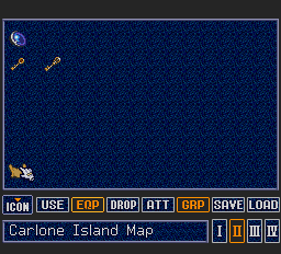
Here's what it looks like on the first level, with me about to select the icon for the classic rolled-up crinkly old faded parchment map ...

And here's what you see next ...

Eeek! That looks a bit strange!

We've still got the dark grey border from the previous screen, but now there is a razor-sharp (not crinkly) scanline transition to a brown map, with an interior crinkly border, and some strange-looking pinky-purple hues for "fading", plus some even stranger-looking green hues for the "fading" on the town name.
Not only that, but you've got blue-stippled shading on the inland part of the island that looks perilously close to the color of the rivers and ocean.
Hmmm ... well, after some thought, I
guess that the pinky-purple and green bits are
probably an attempt to take advantage of the limited color bandwidth of a composite TV signal, and produce more of a subtle brightness change. I've seen that trick used a few times before ... but mostly in the 8-bit era.
But these days, when using a modern high-resolution display with an RGB-modded PCE, or when running on an LCD display with an emulator, those color choices just look, errrr ... "not good" (IMHO).
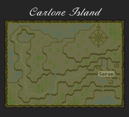
So, with only some palette changes, and without changing Falcom's main map graphics (except for the English names), here is a version that still tries to keep the faded-out and yellowing look, but fix both the strange color-changes, and the inland vegetation color.

Now, there is still the question of whether this is too much of a change from the original graphics, but I currently believe that this both honors Falcom's original intent and style, and also gives us something that will look good on both old composite tube TVs, and modern high-resolution displays.