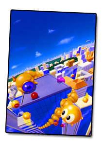
I was always partial to Gomola Speed http://www.pcengine.co.uk/Images-Covers/COVER-Gomola_Speed.jpg
Others, too, I'm sure. I prefer action, landscape scenery, cool Escheresque imagery, rather than just well-drawn Anime faces.
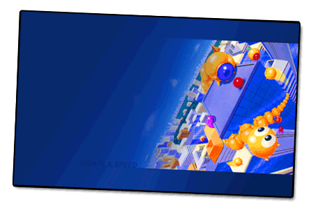
I never made this public, only shared it here at pcefx a few times:
http://archives.tg-16.com/01_tg16_gomola_speed_wallpaper_PC_iPhone.htm[


...but, this was when resolution for mobile was really lame.
8-9 years makes a difference.
Back on topic:


I wrote about this years ago, but I can't find my old post to copy....
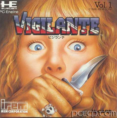
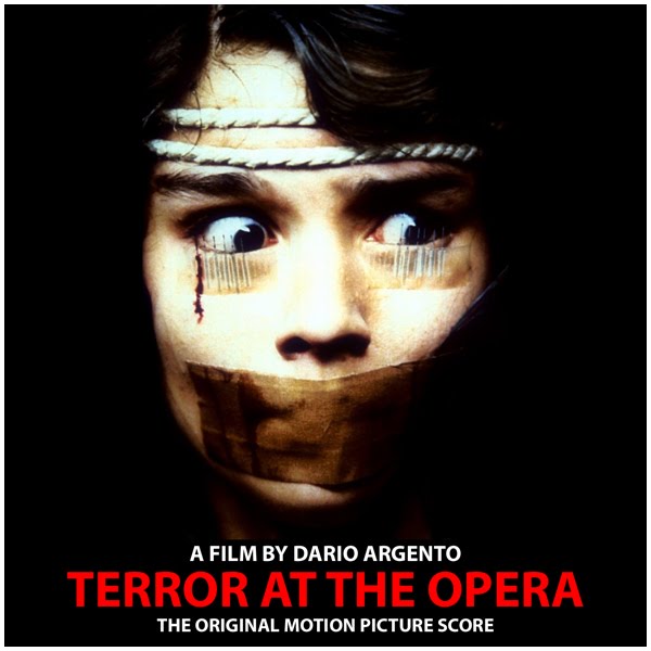
The reason why Vigilante is a favorite is not because the artwork is "amazing"...it's the sheer brutality that is captured in a fantastic composition that harkens back to the imagery I associate strongly with Dario Argento:
Eyes
Knife
Mouth-muted
Piercing, vulnerable eyes
Piercing, blade
Omnipotent fist
If ever there was a video game cover composition that illustrates the physical/emotional/social/political politics of gender, this is it.
Obviously, the discussion of gender has expanded far beyond this image, but for late-80's, or even today, it is still pretty poignant.
We still sexualize and stylize violence in art/film, etc. etc. we still rely on the tired cliches and tropes.
I think the Vigilante cover was inspired by the slasher/horror/thriller film genre and the tone is pretty intense for a children's PCE game.
Context is important. In the late 1980's, the mainstream gamer was not commonly acknowledged to be anything beyond 8-16 year old boys.
Lots of video game covers have tried to show terror, but the compositions were closer in spirit to 1950's horror/Godzilla films with "screaming people"...
...none have the intensity of the seemingly goofy Vigilante cover.
Composition: A+ This could easily have been too "busy" and distracting. I love that a few key elements remain the focus: eyes, blade, mute-by-fist
Artwork: OK. appropriate for a kid's video game...I don't think it would have been approved if it were grittier/more realistic... the artwork softens the brutality...slightly, and makes it even more effective at disturbing me.
Flaws: Depending on how you view it, you might feel that the eyes are "dead" and lifeless (and therefore not effectively communicating "terror")...but I could argue that this makes the message even stronger: She is already a casualty/she is already dead. There is no life left. Even if she were immediately released, the damage has been done. She will never be the same. That's the true horror—we failed before we even began.
Sorry, Madonna. We failed before hitting the RUN button.