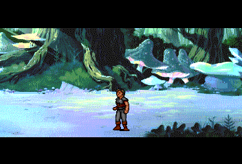
From my understanding the BG graphics were handled by an outside art studio who hand painted them and were later scanned into a computer.
The bgs and cinemas look like they were done by the same artist who worked on other ICOM Sim games like Shapeshifter. They just did a better job converting them into TG-16 graphics.
The BG graphics use more colors than any pce game that i know of, single objects use up to 50 colors, so why the dithered look, the best way i can put it is to imagine taking a digital paint brush, dip and swirl it into the pce color palette(512 colors) then take the brush and drag it across the screen, what you will end up with some times are weird color combinations that don't mix well, in my opinion, this actually looks really good through composite on a CRT TV, which is what i use.
They just didn't bother to clean up the tiles. A good example is the color chunks on the mushrooms/fungus in this pic-

I'm guessing that they came up with a way to automatically convert single screens to <16 color 8 x 8 tiles, since some of the 16 x 16 corners have more than 16 colors... all while keeping the total number of tile palettes in check. It would've been nice to see the result if they used the same process for a game
and cleaned up the tiles. The graphics don't look nearly as good proportionate to the number of colors as an average game, probably because of random color anomalies from converting the graphics and not cleaning them up.
It could be argued that the end result looks like it has photo grain, but it just looks more like dithering to me. It certainly suits this style of game more than any other.
I actually thought that the bgs looked kinda messy and not-so-colorful through composite the first time I played it. It looks much better in S-Video to me.
I'm not a big DKC fan but that would a interesting piece to have.
Same here, but after the novelty wore off I eventually sold it. The same cart had Street Fighter IV on it.
