Author Topic: PCE, SNES and Genesis, screen comparison.  (Read 68372 times)

Black Tiger

  • Hero Member
  • *****
  • Posts: 11242
Re: PCE, SNES and Genesis, screen comparison.
« Reply #495 on: May 14, 2009, 02:02:30 PM »
Here's a Xanadu II shot in full color, then 16 colors and then below the background in 16 colors and finally the background with 75% reduced colors (less of a reduction than BS received at 16 colors).

Since the full screen pic with sprites is 'only' 82 colors, it's fair to compare a 16 color version, sprites and all, to the Beyond Shadowgate 16 color background pics. The spriteless Xanadu II background is only 44 colors before getting reduced, which means a 16 color version is proportionate to the 32 color BS shots.

Full color                                              16 color full image

16 color background                               Background reduced by 75%


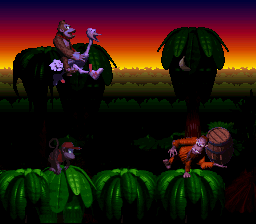
When you tell photoshop to dither a picture, you're giving it creative license to go in and add original artwork. Here's what that DKC screen really looks like when dropped to 16 colors-


This should drive home the point best. Below on the left is a 79 color screen shot from Magical Chase exactly as Magic Engine spits it out. On the right is the same shot in 159 colors. I added real actual PC Engine palette colors to create the pic with twice the number of visible colors. What's the difference? Although it could be argued that some of the additions I made enhance the picture, most of it is just noise.

« Last Edit: April 15, 2014, 12:40:04 PM by Black Tiger »
http://www.superpcenginegrafx.net/forum

Active and drama free PC Engine forum

awack

  • Hero Member
  • *****
  • Posts: 692
Re: PCE, SNES and Genesis, screen comparison.
« Reply #496 on: May 14, 2009, 03:21:02 PM »
Great shots Black Tiger, i can not see any difference in the magical chase shots.Xanadu II took a big hit eh.

Look at the shots blow and tell me thats not incredible, they are all undithered ...due to the art and the way BS uses its colors, it still looks  good at only 16 colors, yet, does not make a big difference if you add 70 or more colors.


16 colors                                              16 colors


16 colors                                               16 colors


Black Tiger, what are your top four pce games as far as graphics go?


Black Tiger

  • Hero Member
  • *****
  • Posts: 11242
Re: PCE, SNES and Genesis, screen comparison.
« Reply #497 on: May 14, 2009, 04:43:16 PM »
Great shots Black Tiger, i can not see any difference in the magical chase shots.Xanadu II took a big hit eh.

Look at the shots blow and tell me thats not incredible, they are all undithered ...due to the art and the way BS uses its colors, it still looks  good at only 16 colors, yet, does not make a big difference if you add 70 or more colors.


Yeah, I think that they did a great job translating the BS bg paintings into graphics, they're just not good examples of high color PCE graphics. The 16 color versions of BS still look much better than the 40+ color Willy Beamish for Sega-CD, which was well done, let alone the slap-in-the-face that is Turbo-CD Loom.


The Willy Beamish shots are from Sega-16.


Quote
Black Tiger, what are your top four pce games as far as graphics go?


I don't like ranking things, even when it comes to something like "favorites" instead of what's "best". I value art and style way more than technical feats. Some of my favorite in-game PCE visuals are the boss sections of Xanadu I & II. Princess Minerva's boss fights look pretty spectacular for what they are. The bosses of Neo Metal Fantasy are like Dark Falz from Phantasy Star. Lords of Thunder is one of the very best 16-bit games visually, for everything that it packs in all the while constantly changing as you progress through a stage. The (unnecessary) trade off of flat bgs and flicker/break up for the overall visuals of Forgotten Worlds is still well worth it. World Heroes 2 and Fatal Fury 2/Special look pretty amazing. Aeroblasters feels like it was custom made for me, the graphics sound and control are all perfect for me and I prefer it overall to the other versions. I'm still amazed at some of the lackluster comments of Dungeon Explorer II's graphics, which I think are about as good as you could ask for.
http://www.superpcenginegrafx.net/forum

Active and drama free PC Engine forum

Tom

  • Guest
Re: PCE, SNES and Genesis, screen comparison.
« Reply #498 on: May 14, 2009, 04:55:03 PM »
Don't forget, photoshop and other apps are not keeping in the PCE's palette when you do color reduction. You get illegal PCE colors. Colors that are inbetween PCE values in order to make the color reduction look passable/decent. You have to correct afterwards.

 Also, dithering on the 16color DKC picks is valid because they don't break the tile/color limit(16 colors fits perfect into 1 subpalette and tile color count) - just make sure to keep them in the console legal color palette definition. If you do reduction down to 32 colors and use dither, you bound to get illegal tiles color counts and such (or exceed the number of sub palettes).

spenoza

  • Hero Member
  • *****
  • Posts: 2751
Re: PCE, SNES and Genesis, screen comparison.
« Reply #499 on: May 14, 2009, 05:28:03 PM »
OK, before we veer TOO far away from the point of all this, Beyond Shadowgate, however nice the backgrounds look, suffers from what could be considered unnecessary dithering. A little more work on those backgrounds could have resulted in something clearer and nicer without all the dithering mess.
<a href="http://www.pcedaisakusen.net/2/34/103/show-collection.htm" class="bbc_link" target="_blank">My meager PC Engine Collection so far.</a><br><a href="https://www.pcenginefx.com/forums/" class="bbc_link" target="_blank">PC Engine Software Bible</a><br><a href="http://www.racketboy.com/forum/" c

Arkhan

  • Hero Member
  • *****
  • Posts: 14142
  • Fuck Elmer.
    • Incessant Negativity Software
Re: PCE, SNES and Genesis, screen comparison.
« Reply #500 on: May 14, 2009, 09:26:38 PM »
OK, before we veer TOO far away from the point of all this, Beyond Shadowgate, however nice the backgrounds look, suffers from what could be considered unnecessary dithering. A little more work on those backgrounds could have resulted in something clearer and nicer without all the dithering mess.

but, dithering looks happy and good on a CRT .... >_>
[Fri 19:34]<nectarsis> been wanting to try that one for awhile now Ope
[Fri 19:33]<Opethian> l;ol huge dong

I'm a max level Forum Warrior.  I'm immortal.
If you're not ready to defend your claims, don't post em.

Necromancer

  • Global Moderator
  • Hero Member
  • *****
  • Posts: 21366
Re: PCE, SNES and Genesis, screen comparison.
« Reply #501 on: May 15, 2009, 02:58:12 AM »
Thanks for posting the Xanadu II pics, Black Tiger.  Is there an easy way to count the occurrence of each color in a pic?  I'm wondering what percentage of colors in the Beyond Shadowgate pics appear in only a handful of pixels, similar to the 'noise' you added to the Magical Chase pic.
U.S. Collection: 97% complete    155/159 titles

awack

  • Hero Member
  • *****
  • Posts: 692
Re: PCE, SNES and Genesis, screen comparison.
« Reply #502 on: May 15, 2009, 01:36:14 PM »
Hit the Ice.


            pce                                               genesis


Warsong.

            pce                                                       genesis


Quote
I'm still amazed at some of the lackluster comments of Dungeon Explorer II's graphics, which I think are about as good as you could ask for.

Some of the better parts are missing in crystal beans, its also missing some detail here and there.
« Last Edit: May 15, 2009, 01:39:55 PM by awack »

Joe Redifer

  • Hero Member
  • *****
  • Posts: 8178
Re: PCE, SNES and Genesis, screen comparison.
« Reply #503 on: May 15, 2009, 02:16:35 PM »
Hit the Ice is a toss up.  They are both different with neither really being better.  They both look very odd.  Warsong is also a toss up.  Better resolution on the Genesis and a bit brighter on the PCE.  Actually I think I will give the edge to the PCE on that one.  It is just a bit more pleasing to my eye.

ceti alpha

  • Hero Member
  • *****
  • Posts: 3835
Re: PCE, SNES and Genesis, screen comparison.
« Reply #504 on: May 15, 2009, 04:20:06 PM »
Hit the Ice is a toss up.  They are both different with neither really being better.  They both look very odd.  Warsong is also a toss up.  Better resolution on the Genesis and a bit brighter on the PCE.  Actually I think I will give the edge to the PCE on that one.  It is just a bit more pleasing to my eye.

Yeah, Hit the Ice does look strange on both ports. These comparisons are very, very close.


"Let the CAW and Mystery of a Journey Unlike Any Other Begin"

Tatsujin

  • Hero Member
  • *****
  • Posts: 12311
Re: PCE, SNES and Genesis, screen comparison.
« Reply #505 on: May 15, 2009, 05:58:11 PM »
i would give my vote for the md hit of the ice, since it has more details, bigger sprites and looks more arcadish!
www.pcedaisakusen.net
the home of your individual PC Engine collection!!
PCE Games coundown: 690/737 (47 to go or 93.6% clear)
PCE Shmups countdown: 111/111 (all clear!!)
Sega does what Nintendon't, but only NEC does better than both together!^^

nat

  • Hero Member
  • *****
  • Posts: 7085
Re: PCE, SNES and Genesis, screen comparison.
« Reply #506 on: May 15, 2009, 07:18:24 PM »
I'm inspired on this one by the Warsong comparison up there. This is a somewhat unfair comparison as the PC-FX screen captures are of a markably lower quality than that of the PS and Saturn caps. When viewing the PC-FX screens, keep in mind that the game isn't really washed out like it appears here-- it's colored just as dark and richly as the other two versions. I think part of the problem is that the Saturn and PS caps are straight from emulators while the PC-FX caps look like they were taken from a TV. I stole 100% of these images as I can't be bothered to capture my own.

This is Warsong 2/Langrisser II/Der Langrisser FX (same game). One of my personal all-time favorite games.


PC-FX                                          Saturn                                          Playstation               


EDIT: While I only own the PC-FX version, the Playstation version looks from the screencaps like the exact same game, pixel-for-pixel while the Saturn version looks like it is basically the same game with subtly redrawn graphics. Also, the PC-FX has beautiful FMV cutscenes; I can't speak for the other two.
« Last Edit: May 15, 2009, 08:13:44 PM by nat »

shubibiman

  • Hero Member
  • *****
  • Posts: 1832
Re: PCE, SNES and Genesis, screen comparison.
« Reply #507 on: May 15, 2009, 08:55:51 PM »
Man! I had never heard of a genny version of Hit The Ice! Was it released in the US?
Self proclamed Aldynes World Champion

SuperDeadite

  • Hero Member
  • *****
  • Posts: 2096
Re: PCE, SNES and Genesis, screen comparison.
« Reply #508 on: May 15, 2009, 11:59:06 PM »
Der Langrisser is a toss up.  The PC-FX version has more cutscenes, "hard mode" (the dialog is rewritten as a drunken comedy), and more spoken dialog.  But, it has less story paths then the others, and when you use spells, the game has to pause and load.  The PS and Saturn versions have cutscenes, but are missing a few and the quality is lower.  They play smoother though and don't pause when using spells.  The PS1 and Saturn versions also include the oringinal Langrisser on the same disk.

The Saturn port was the final version of the game, it has extra story paths and scenarios, it's a long game.  Also the character portraits were redone again.  And has higher in game resolution then the playstation.  Saturn is my favorite version.  I'd love to play PC-FX hard mode, but the spell loading times get really annoying if you've played the other versions.
Stronger Than Your Average Deadite

Black Tiger

  • Hero Member
  • *****
  • Posts: 11242
Re: PCE, SNES and Genesis, screen comparison.
« Reply #509 on: May 16, 2009, 04:38:43 AM »
If we're doing a Langrisser 2 comparison, why not include the MD and SFC games? Does Magic Engine FX have a demo mode like the PCE version? Do the 32-bit Langrisser 2's all use CD music for everything?

It'd also be cool to see the Saturn and PSX Langrisser 1's compared to the MD and PCE versions, although the 32-bit versions were basically directly ported from the PCE version. Are those "Warsong" shots from Warsong or Langrisser MD? Warsong had the portraits redrawn and possibly other alterations.


I think that Hit the Ice looks better on Genesis.
http://www.superpcenginegrafx.net/forum

Active and drama free PC Engine forum