Author Topic: PCE, SNES and Genesis, screen comparison.  (Read 68002 times)

Keranu

  • Hero Member
  • *****
  • Posts: 9054
Re: PCE, SNES and Genesis, screen comparison.
« Reply #180 on: April 08, 2009, 09:31:15 AM »
Wow, I always remember the TG16 Aero Blasters looking a little better than the Genesis, but these screenshots are making me think the opposite.

Tom, those Forgotten World screenshots are very interesting. I think the converted PCE pal screenshot has nicer shading than the arcade!
Quote from: Bonknuts
Adding PCE console specific layer on top of that, makes for an interesting challenge (no, not a reference to Ys II).

Joe Redifer

  • Hero Member
  • *****
  • Posts: 8178
Re: PCE, SNES and Genesis, screen comparison.
« Reply #181 on: April 08, 2009, 11:37:24 AM »
The Genesis version of Aero Blasters does look better graphically in pretty much all areas, but the TG-16 version is still the version I'd rather play.  It doesn't have the pseudo-loading screen and just seems to have smoother control.  Oh, and the music is better.

Here is my official comparison for Sega-16

Tom

  • Guest
Re: PCE, SNES and Genesis, screen comparison.
« Reply #182 on: April 08, 2009, 12:57:34 PM »
Wow, I always remember the TG16 Aero Blasters looking a little better than the Genesis, but these screenshots are making me think the opposite.

 I did a compare a long time ago. The TG16 version has more colors, mostly on the sprites, but in the over all of things you really can't tell. This is one port that looked great on the Genesis. I had played the Genesis version tons before picking up the hucard a year later.

lkermel

  • Sr. Member
  • ****
  • Posts: 267
Re: PCE, SNES and Genesis, screen comparison.
« Reply #183 on: April 08, 2009, 01:03:16 PM »
The Genesis version of Aero Blasters does look better graphically in pretty much all areas, but the TG-16 version is still the version I'd rather play.  It doesn't have the pseudo-loading screen and just seems to have smoother control.  Oh, and the music is better.

Same here, I find the whole game a lot smoother on the PCE... the Genesis version has a nice parallax scrolling though, If I remember well.

About Forgotten Worlds, I remember playing the PCE version and the Arcade simultaneously (while I was testing it for my site) and I was gob smacked by how good Nec Avenues's conversion was. I only wish Nec had done a sinmilar job with Strider Hiryu...


Black Tiger

  • Hero Member
  • *****
  • Posts: 11242
Re: PCE, SNES and Genesis, screen comparison.
« Reply #184 on: April 08, 2009, 02:05:05 PM »
Wow, I always remember the TG16 Aero Blasters looking a little better than the Genesis, but these screenshots are making me think the opposite.

Tom, those Forgotten World screenshots are very interesting. I think the converted PCE pal screenshot has nicer shading than the arcade!


A while back when Tatsujin started a thread about SFII port resolutions, I made some regular sized Forgotten Worlds screen shots, including the arcade colored with PCE palette colors.

The left image is the regular arcade, the right is the arcade in PCE color-


The PCE pallete sure loves CPS games. :D Too bad more developers didn't take advantage. I think that most of the sprites in the game were transferred pixel for pixel, making them even bigger on screen than in the arcade. If having CPS arcade sized sprites against backgrounds like these means a little flicker, I'll gladly take it over an average 16-bit console port.

The game still runs at a higher resolution than the regular resolution of every Genesis and SNES game while maintaining a high level of shading and detail. This combo is a real strength that the PCE has over the other consoles and should have happened in more games, especially non-sprite intensive stuff like RPGs. It still wouldn't have taken much to add some layered scrolling in places, but it always seems that every PCE developer only knew how to do some things, but none knew how to do them all. But with sampled sfx and CD music, layered bgs really are the only element missing aesthetically.

Here is the regular arcade and PCE screens lined up-


I like the changes they made with the coloring, but like the blue highlights on the bg should have been kept.


The Genesis version still has nice graphics and was very impressive and really fun when it came out. It was one of my favorite early Genesis games.
« Last Edit: July 08, 2017, 01:27:25 PM by Black Tiger »
http://www.superpcenginegrafx.net/forum

Active and drama free PC Engine forum

ParanoiaDragon

  • Hero Member
  • *****
  • Posts: 4619
Re: PCE, SNES and Genesis, screen comparison.
« Reply #185 on: April 08, 2009, 07:15:57 PM »
As for Raiden, the SNES version looks like crap compared to the SNES version, & I mean that!

Now who can argue with such flawless logic?  It's so damn shitty, comparisons are entirely unnecessary.  :lol:

That's awesome, was I tired when I wrote that?  I ain't changin' it, I stand by my opinion! :dance:

ceti alpha

  • Hero Member
  • *****
  • Posts: 3835
Re: PCE, SNES and Genesis, screen comparison.
« Reply #186 on: April 08, 2009, 07:35:45 PM »
As for Raiden, the SNES version looks like crap compared to the SNES version, & I mean that!

Now who can argue with such flawless logic?  It's so damn shitty, comparisons are entirely unnecessary.  :lol:

That's awesome, was I tired when I wrote that?  I ain't changin' it, I stand by my opinion! :dance:

I can appreciate conviction!  :P


"Let the CAW and Mystery of a Journey Unlike Any Other Begin"

termis

  • Hero Member
  • *****
  • Posts: 1485
Re: PCE, SNES and Genesis, screen comparison.
« Reply #187 on: April 08, 2009, 07:47:36 PM »
I just checked out game pro's Forgotten Worlds review and it was the total opposite, calling the genesis version forgettable and the pce graphically spectacular.. i just dont know who to believe.

Anyone who thinks the Genesis version of Forgotten Worlds looks better is gotta be blind!

But real(!) two-player co-op play -- that's was a huge loss for the PCE version.

On a sidenote, I still did enjoy the Genesis version.  I think it was the 2nd or 3rd game Genesis game I bought.  Subsequently someone swiped it when I accidentally left it sitting on top of an arcade cabinet (while I was playing another arcade game) at a local donut shop.  :cry:

ceti alpha

  • Hero Member
  • *****
  • Posts: 3835
Re: PCE, SNES and Genesis, screen comparison.
« Reply #188 on: April 08, 2009, 07:49:18 PM »
I just checked out game pro's Forgotten Worlds review and it was the total opposite, calling the genesis version forgettable and the pce graphically spectacular.. i just dont know who to believe.

Anyone who thinks the Genesis version of Forgotten Worlds looks better is gotta be blind!

But real(!) two-player co-op play -- that's was a huge loss for the PCE version.

On a sidenote, I still did enjoy the Genesis version.  I think it was the 2nd or 3rd game Genesis game I bought.  Subsequently someone swiped it when I accidentally left it sitting on top of an arcade cabinet (while I was playing another arcade game) at a local donut shop.  :cry:

 :cry:


"Let the CAW and Mystery of a Journey Unlike Any Other Begin"

Tatsujin

  • Hero Member
  • *****
  • Posts: 12311
Re: PCE, SNES and Genesis, screen comparison.
« Reply #189 on: April 08, 2009, 08:35:12 PM »
Here's what GameFan had to say about Forgotten Worlds (from issue 2):

'Genesis version came closer' to being arcade perfect.  Only if you don't look at the backgrounds and sprites, ya bunch of worthless meat sacks.  ](*,)

muahahaha..if those suckers wheren't the biggest morrons on earth, then who else?
« Last Edit: April 08, 2009, 08:38:12 PM by Tatsujin »
www.pcedaisakusen.net
the home of your individual PC Engine collection!!
PCE Games coundown: 690/737 (47 to go or 93.6% clear)
PCE Shmups countdown: 111/111 (all clear!!)
Sega does what Nintendon't, but only NEC does better than both together!^^

esteban

  • Hero Member
  • *****
  • Posts: 24063
Re: PCE, SNES and Genesis, screen comparison.
« Reply #190 on: April 09, 2009, 05:28:18 AM »
The Genesis version of Aero Blasters does look better graphically in pretty much all areas, but the TG-16 version is still the version I'd rather play.  It doesn't have the pseudo-loading screen and just seems to have smoother control.  Oh, and the music is better.

Here is my official comparison for Sega-16


Hey, that was fun to (re)read. I must have read it back in the day, but surely I would have remembered Kaneko's "FREE GLOVE" offer? That is awesome... do you know if gloves were promoted with any other games (outside of Kaneko)? I don't remember seeing any...

Now I'll listen to the Genny's tunes...
  |    | 

awack

  • Hero Member
  • *****
  • Posts: 692
Re: PCE, SNES and Genesis, screen comparison.
« Reply #191 on: April 11, 2009, 10:10:16 AM »
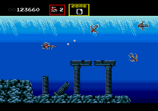
Darius 2.
       
                pce                                               genesis


Black Tiger

  • Hero Member
  • *****
  • Posts: 11242
Re: PCE, SNES and Genesis, screen comparison.
« Reply #192 on: April 11, 2009, 10:43:44 AM »
Here are some pics from one of my many unfinished projects-

ARCADE-


PC ENGINE-


MEGA DRIVE & SMS-


ARCADE-


PC ENGINE-


MEGA DRIVE & SMS-


ARCADE-


PC ENGINE-


MEGA DRIVE & SMS-


« Last Edit: March 18, 2012, 09:48:31 AM by Black Tiger »
http://www.superpcenginegrafx.net/forum

Active and drama free PC Engine forum

awack

  • Hero Member
  • *****
  • Posts: 692
Re: PCE, SNES and Genesis, screen comparison.
« Reply #193 on: April 11, 2009, 11:09:09 AM »
I haven't played the master system version, i heard its pretty good.

Its hard to match these up since the pce port has slightly more varied levels.


Compare to screenshot above
              pce                                               genesis

« Last Edit: April 11, 2009, 11:13:11 AM by awack »

Black Tiger

  • Hero Member
  • *****
  • Posts: 11242
Re: PCE, SNES and Genesis, screen comparison.
« Reply #194 on: April 11, 2009, 11:26:16 AM »
I haven't played the master system version, i heard its pretty good.

Its hard to match these up since the pce port has slightly more varied levels.


Here are a couple pics that are the Super Darius 2 equivalent. It's also hard to do direct comparisons with single screenshots since the PCE version has half of its background off screen due to the detail.


I think that the PCE version looks better overall than the arcade. In places where the graphics are more or less identical, the PCE version uses much nicer colors. The redrawn/different minibosses are WAY better and so are most of the main bosses.

The MD and SMS ports compare more to each other than to the PCE and arcade, but both are very well done, although an MD port could always be better. The MD and SMS versions have Air Zonk style bg scrolling in places that it looks like the arcade does as well. After comparing the Saturn version to the PCE version for awhile, I thought that it was an addition to the Sega ports. But for some reason, that particular scrolling effect is only missing from the Saturn & PCE versions, even though it wouldn't take any tricks to enable inthe PCE version that aren't already done in other sections. #-o

I mentioned earlier in this thread how it seems that every developer knew how to do some things, but always seem to miss others. Aside from that simple to implement effect, the CE version doesn't use any adpcm samples and sounds kinda quiet as a result. The PSG sounds are okay and even the arcade is kinda quiet most of the time, but aside from sampled explosion sfx, they could've at least included the dialogue from the first stage.

What the screen shots don't show much of, is how the average enemy sprites are 2 - 4 times bigger on PCE and are pretty much all the same size as the arcade, except many are drawn and/or shaded better. Once the weapons are fully powered they take up half the screen, yet there is very little flicker, even with many screen filling bosses made from sprites.
« Last Edit: April 14, 2012, 08:05:16 PM by Black Tiger »
http://www.superpcenginegrafx.net/forum

Active and drama free PC Engine forum