Author Topic: PCE, SNES and Genesis, screen comparison.  (Read 68205 times)

Tom

  • Guest
Re: PCE, SNES and Genesis, screen comparison.
« Reply #255 on: April 16, 2009, 05:57:52 PM »
The Sega CD version is way ahead in this case. It is much more impressive when you see it animated.

I agree. The Sega CD wins, with SNES coming in a close second and the PCE coming in a distant third.
This is a game I actually heard about when it was released but have never played it. To be honest, I had forgotten about it!

I really like the PC-Engine version the best of the three from the screen shots. I love the way the colorful 8-bitty graphics come across. It seems like it has a lot of old school feel to it but with the added spice of the PC-Engine CD Rom (cinematics, music, voices) that make the Ys games so awesome.

 It actually plays like Legacy of the Wizard (which is Dragon Slayer series game by Falcom ). I like it :D

rag-time4

  • Hero Member
  • *****
  • Posts: 1773
Re: PCE, SNES and Genesis, screen comparison.
« Reply #256 on: April 16, 2009, 06:12:35 PM »


 It actually plays like Legacy of the Wizard (which is Dragon Slayer series game by Falcom ). I like it :D
Legacy of the Wizard is a NES game i really need to get. I haven't played it much at all!

boogiecat

  • Newbie
  • *
  • Posts: 37
Re: PCE, SNES and Genesis, screen comparison.
« Reply #257 on: April 17, 2009, 12:59:25 PM »
I'm only doing games i own, which means I'm not going to be able to do other games such as Popful mail, since i don't own the sega cd version, maybe some one else can do it, i would like to see that one myself.


Bump for Popful Mail before I fall asleep. I couldn't get Gens to detect my CD-ROM on this computer, so I stole the MCD pics from Classic CD RPGs-


PC ENGINE - SEGA-CD - SUPER FAMICOM


Without getting into much detail...

The SFC version has very nice coloring and shading, like the Xanadu II boss fights. But the tiles are reused so frequently that it ruins the experience. That and the sprite art looks lame.

The Sega version has nice art in-game graphics art and the shading is alright, but they didn't do a good enough job (by Sega standards) with the color. The cinemas are nice and clean and smoothly animated, but extremely low color, with the three main characters sharing the same 3 main colors.

The PCE cinemas are also animated as well as a tv show, but are colorful and shaded like a top quality PCE cinema.


Wow great comparison there!!

awack

  • Hero Member
  • *****
  • Posts: 692
Re: PCE, SNES and Genesis, screen comparison.
« Reply #258 on: April 19, 2009, 06:15:28 AM »
Dungeon Explorer II.


               pce                                               snes


three cool action shots for the hell of it.


« Last Edit: April 19, 2009, 09:11:33 AM by awack »

Black Tiger

  • Hero Member
  • *****
  • Posts: 11242
Re: PCE, SNES and Genesis, screen comparison.
« Reply #259 on: April 19, 2009, 10:57:06 AM »
Good job with the quantity of shots and some of the clever match ups. :clap: It's cool to see in the sections of Crystal Beans I haven't yet played, that they did as good a job as they did. Still no contest for DEII of course. :) The final boss looks the same playing them separately on real hardware. The music was translated to SFC about as well as it could be and still sounds great. I still prefer DE1 PSG though. :P
http://www.superpcenginegrafx.net/forum

Active and drama free PC Engine forum

ceti alpha

  • Hero Member
  • *****
  • Posts: 3835
Re: PCE, SNES and Genesis, screen comparison.
« Reply #260 on: April 19, 2009, 11:04:57 AM »
Crystal Beans seems to lose a lot of the dark atmosphere of DEII, especially in the outside shots. In the outside comparison four down, the background on CB is all cheery and bright with colourful flowers, while DEII is dark and foreboding. I also don't like the Zelda/Neutopia style of character.

I still prefer DE1 PSG though. :P

And who could blame you?  8)


"Let the CAW and Mystery of a Journey Unlike Any Other Begin"

awack

  • Hero Member
  • *****
  • Posts: 692
Re: PCE, SNES and Genesis, screen comparison.
« Reply #261 on: April 19, 2009, 12:24:18 PM »
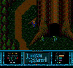
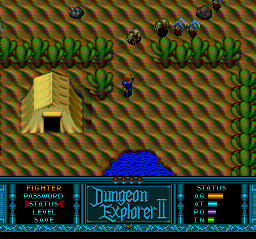
Crystal beans is basically an abbreviated DE II with some alterations, there are areas completely missing as the pce DE II screens below show(desert and outside of tree are not in Crystal Beans), thats due in large part in how the games are set up, Crystal beans you click on a map to travel to a different area, DE II you have to travel from place to place on foot.
esteban

  • Hero Member
  • *****
  • Posts: 24063
Re: PCE, SNES and Genesis, screen comparison.
« Reply #262 on: April 19, 2009, 01:03:21 PM »
Crystal beans is basically an abbreviated DE II with some alterations, there are areas completely missing as the pce DE II screens below show(desert and outside of tree are not in Crystal Beans), thats due in large part in how the games are set up, Crystal beans you click on a map to travel to a different area, DE II you have to travel from place to place on foot.


Thanks for the screenshots, it really is neat to see these comparisons :)

Crystal Beans seems to lose a lot of the dark atmosphere of DEII, especially in the outside shots. In the outside comparison four down, the background on CB is all cheery and bright with colourful flowers, while DEII is dark and foreboding. I also don't like the Zelda/Neutopia style of character.


I concur. While I don't mind the CUTIE overworld in Crystal Beans, it certainly isn't nearly as neat as the consistent, dark, brooding atmosphere in DEII.

I am also in agreement with Black_Tiger about the quality of the DE1's PSG tunes: they really hold their own. I love the Red Book in DEII, but DE1 stands firm.

  |    | 

Joe Redifer

  • Hero Member
  • *****
  • Posts: 8178
Re: PCE, SNES and Genesis, screen comparison.
« Reply #263 on: April 19, 2009, 01:37:58 PM »
The TurboGrafx-16 version is darker and that means it MUST be inferior.  Brighter and more saturated is ALWAYS better.  SNES wins, even if it is worse.

By the way, "Crystal Beans" is probably one of the worst names for a game evar.

Turbo D

  • Hero Member
  • *****
  • Posts: 3989
Re: PCE, SNES and Genesis, screen comparison.
« Reply #264 on: April 19, 2009, 02:39:17 PM »
Joe is right; Crystal Beans = Instant Fail for having such a gay name. :x

TR0N

  • Hero Member
  • *****
  • Posts: 6421
Re: PCE, SNES and Genesis, screen comparison.
« Reply #265 on: April 19, 2009, 08:12:04 PM »
Hmm i had no idea there was a snes DEII.The snes,DEII looks more colorful beside the bigger sprites but that's it i sure can't judge it's gameplay so dunno.Still i assume it won't beat the pce version on it's music  :wink:

PSN:MrNeoGeo
Wii U:Progearspec

Tatsujin

  • Hero Member
  • *****
  • Posts: 12311
Re: PCE, SNES and Genesis, screen comparison.
« Reply #266 on: April 19, 2009, 09:45:10 PM »
the PCE DEII has one of the most terrible goosebumb giving intros. alone for that fact, it is far superior.
www.pcedaisakusen.net
the home of your individual PC Engine collection!!
PCE Games coundown: 690/737 (47 to go or 93.6% clear)
PCE Shmups countdown: 111/111 (all clear!!)
Sega does what Nintendon't, but only NEC does better than both together!^^

shubibiman

  • Hero Member
  • *****
  • Posts: 1832
Re: PCE, SNES and Genesis, screen comparison.
« Reply #267 on: April 20, 2009, 02:04:58 AM »
Hmm i had no idea there was a snes DEII.

Me neither  :shock:
Self proclamed Aldynes World Champion

Necromancer

  • Global Moderator
  • Hero Member
  • *****
  • Posts: 21366
Re: PCE, SNES and Genesis, screen comparison.
« Reply #268 on: April 20, 2009, 04:10:57 AM »
Crystal Beans seems to lose a lot of the dark atmosphere of DEII, especially in the outside shots. In the outside comparison four down, the background on CB is all cheery and bright with colorful flowers, while DEII is dark and foreboding. I also don't like the Zelda/Neutopia style of character.

I agree with you 100% on the cartoony (and poorly scaled) character sprites, but I actually prefer the brighter colors used in the SNES version, though only for in the villages/overworld.  Dark and brooding works well in dungeons and forests, but not so much in the above ground world, giving it a 'middle of an eclipse' look.
U.S. Collection: 97% complete    155/159 titles

Arkhan

  • Hero Member
  • *****
  • Posts: 14142
  • Fuck Elmer.
    • Incessant Negativity Software
Re: PCE, SNES and Genesis, screen comparison.
« Reply #269 on: April 20, 2009, 08:07:11 PM »
I dunno, I don't own any of them and right now I'm leaning towards finding the SNES version first based on those screens. Unfortunately, the Duo version looks like a distant third.

It (popful mail) plays more like a Valis or Ys III than DS IV.

From personal experience the Sega CD one plays nicest.

SNES is iffy.  You miss out on the funny cutscenes even if the graphics look a bit more lush.


...wheres the PC98 screens :-D
[Fri 19:34]<nectarsis> been wanting to try that one for awhile now Ope
[Fri 19:33]<Opethian> l;ol huge dong

I'm a max level Forum Warrior.  I'm immortal.
If you're not ready to defend your claims, don't post em.