... most of 'em are utterly awful and tasteless (at least those which I know), but I'm sure, there are some exeptions (like GoT) 
now it's your turn to prove, that the americans didn't just do tastless rubbish  ...
...
I used to feel this way, back in the 90's. In the past, I would have loved for the TG-16 to actually have kool, ass-kicking art and packaging.
But since then, I have taken a slightly different approach (I've applied this to the
art in magazines as well):
1. Yes, much of the early (pre-TTi) art is lackluster in every respect (composition, execution, medium, skill of artist, etc.).
2. Some of these covers have an amateurish charm, while others are flat out cheesy.
3. That said, TG-16 coverart is, for the most part, original and unique art (of course, some art, like Space Harrier, is a straight clone of the Japanese original).
For me, #3 is the crucial point-- we should be happy that North America was able to add something to PCE history by contributing unique (at times laughable) artwork. The fact that this art brings a smile or smirk to our faces makes it more endearing and enjoyable.
And so...
4. The lame art of yesteryear is more charming and special now. It also helps define TG-16, since the composition and medium (pastel painting?) was pretty consistent. I don't think it was intentional, but this art became part of the "branding" and part of the TG-16 experience.
5. I don't know if a single artist was commissioned to do all of the art (I doubt it), but so much of it looks like the product of one person. TG-16 covers can be faulted for being
too similar in execution and lacking variety. No risks! No pen & ink. No photographs. Nothing but...
6. What was the medium? I can't tell if it was colored pencil on paper, cray pas on burlap, or crayon on cardboard.
7. Off topic!
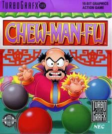
8. Chew Man Fu is simple, but packs more punch than the Japanese coverart, IMO:


Don't get me wrong, I like the Japanese Be Ball art... but it is crowded, and FLAT (there is no sense of depth). Still, Be Ball has cute stuff, which is good. But, from a "composition and execution" standpoint, I think the US cover is more striking and visually appealing.
I'd love a Chew Man Fu T-shirt / poster. Striking, emotive (I mean, look at the mean bastard... and his colorful balls).
9. Valis III has a great friggin' logo (for gaudy, heavy-metal tastes), and exudes a dark, somber atmosphere (which I like)...


...but our heroine is just a bit "odd" looking. Individually, her body parts seem OK, but taken together as a whole, well, something goes awry. I'd even give a pass on the platinum bustiere, but... So close, yet so far away.
AND YET, at the end of the day, I prefer US VALIS III! Japan's cover is nice, but generic. It doesn't emote anything, really. And the Japanese logo is great, but it is downplayed in the composition and actually CLASHES with the anime-style heroines. The US cover
embraces its heavy-metal logo. Overall, the TG-CD cover is consistent and coherent.
It's a goddamn work of art.
And our odd-looking heroine? Well, she just makes things even more special (albeit disjointed!), because she doesn't resemble Yuko from the cinemas at all.
The US cover fails to captue Yuko, opting instead for Sandra Bullock (who is a man, let's face it). Now that's localization for ya'!