Ha! I'll never grow tired of the U.S. Valis III hottie. But, the funny thing is that the Valis III cover is still MUCH MUCH MUCH kooler than
the Valis II (US) artwork. I'm serious. The Valis III hottie stares at you and really grabs your attention, which cannot be said for Valis II's boring composition (Yuko is chubby, and we don't see her face... I always though this cover composition was inspired by the wonderwoman tv show, by the way. A chubby Linda Carter...).
Anyway, I must have accidentally deleted a whole bunch of cover scans from my folder, so I am only able to recycle a few images for this topic:

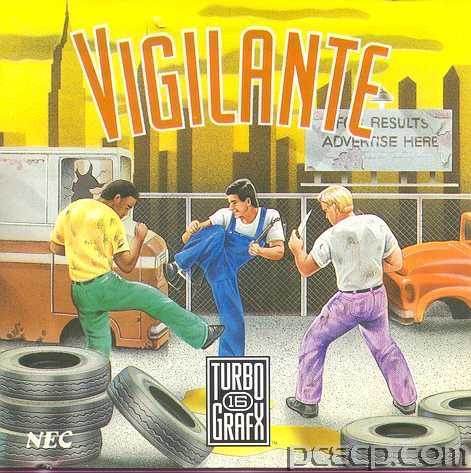
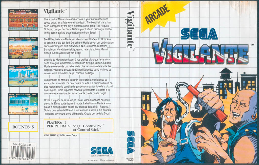
This cover deserves some credit: it is totally devoid of action, excitement, and peril... substituting wooden poses, pastel overalls and lifelessness in their stead. For those who've played the game, you might agree with me that an in-game screenshot would have been a better choice for the US cover art (of, say, the mohawk boss on the bridge). Even the Sega Master System (PAL) had cover art that captured the spirit of the game more successfully:

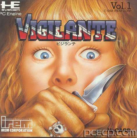
Of course, the best choice would have been to keep the original Japanese coverart. But, I must say, this cover is so goddam kool (and disturbing, and full of violence), that I can understand why it wasn't used:

It is interesting to note that although the US version features a junkyard thug brandishing a mighty scary blade, the Japanese version is simply a work of violent art.
And the Japanese cover isn't gratuitious: all of the violence and fear is suggestive, but there is no actual blood or gore. All the violence is in the clenched fist and glinting steel, all the fear is in Madonna's eyes. CLICHES? Yes, these symbols are some of the most over-used and hackneyed images in pulp fiction and horror movie art. But the composition is so striking, it transcends the cliches.
This cover is friggin' beautiful.
I challenge anyone to find another composition, for any platform that elicits an emotional response like Vigilante JP.
For fans of Dario Argento: The Vigilante JP coverart looks like it could have been inspired by Argento's aesthetics. Not that it actually was, mind you, but there are similar themes (extreme close-ups, eyes, blades, muted mouths, etc.)
/end of sermon[/url]